‘Just Baked’ gets a new visual identity…and its golden
We recently had the pleasure of working with the ever popular, Little Brownie Company, who was soon to be opening their very first cafe, ‘Just Baked’. Despite the Little Brownie Company being a well established brand already, the owner wanted the cafe to have its own name, and ultimately a brand new and original visual identity that would fit with the slightly more feminine, Insta-grammable, and aesthetic vision that she had for her new spot in Bedford. Here's a look at how we approached the project…
Understanding the Client's Needs
The first step in any rebrand is understanding the client's needs and goals. We kicked everything off with a discussion to understand her vision for the new cafe and what she wanted the brand to communicate. The answer to this was a feminine and playful aesthetic, with a focus on Insta-grammable elements that would attract a younger audience.
Research and Inspiration
Once we had a clear idea of the client's vision, we began researching and gathering inspiration for Just Baked’s new visual identity. We looked at other successful bakery and cafe brands, paying close attention to those with a strong social media presence - this was key for Michaella. We also explored a variety of colour palettes and typography options that would suit the aesthetic.

Developing the New Logo
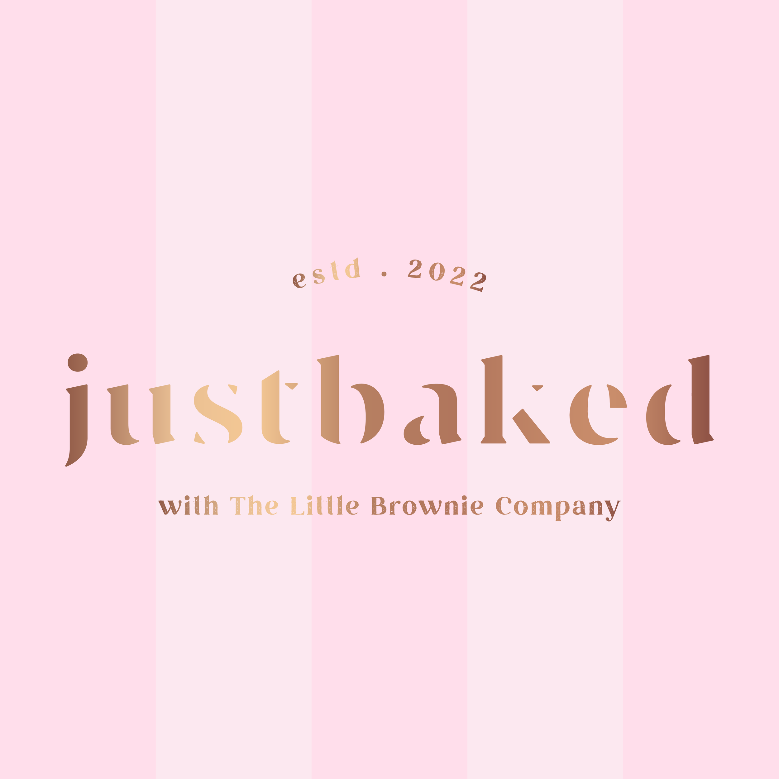
We always start by sketching out ideas. We wanted the logo to be simple, yet modern and eye-catching, but staying away from your usual cupcakes and iconised logos. We ultimately landed on a design that resembles a baking stencil, yet so subtly that it doesn’t overpower or complicate the design. The colour palette we chose included soft pinks with a pop of gold for that unique, insta-grammable vibe.
Applying the New Visual Identity
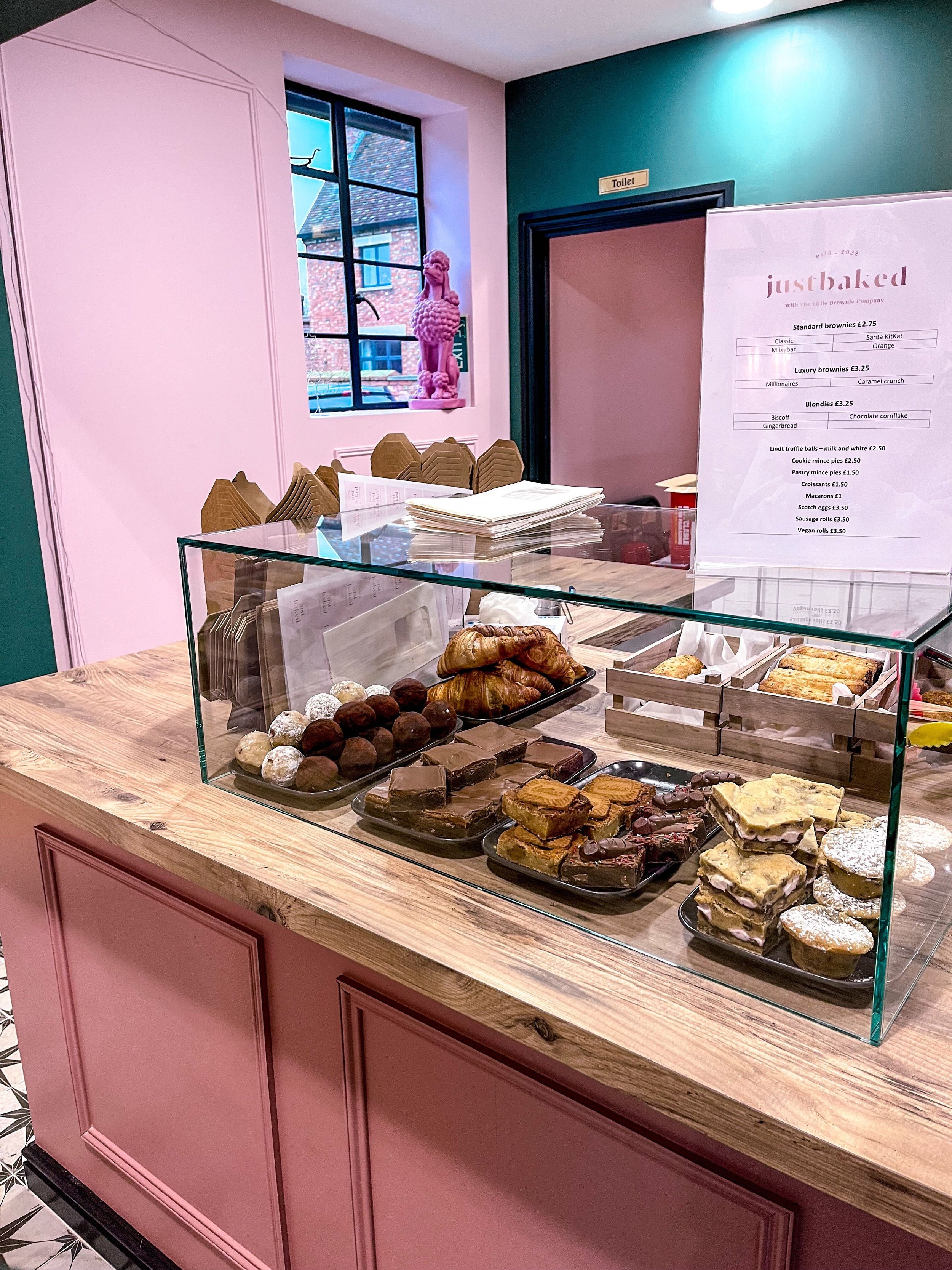
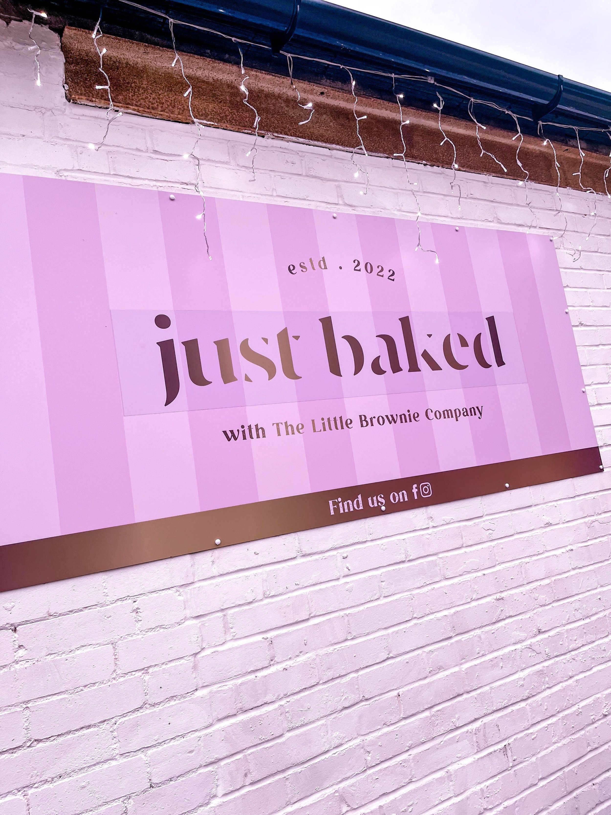
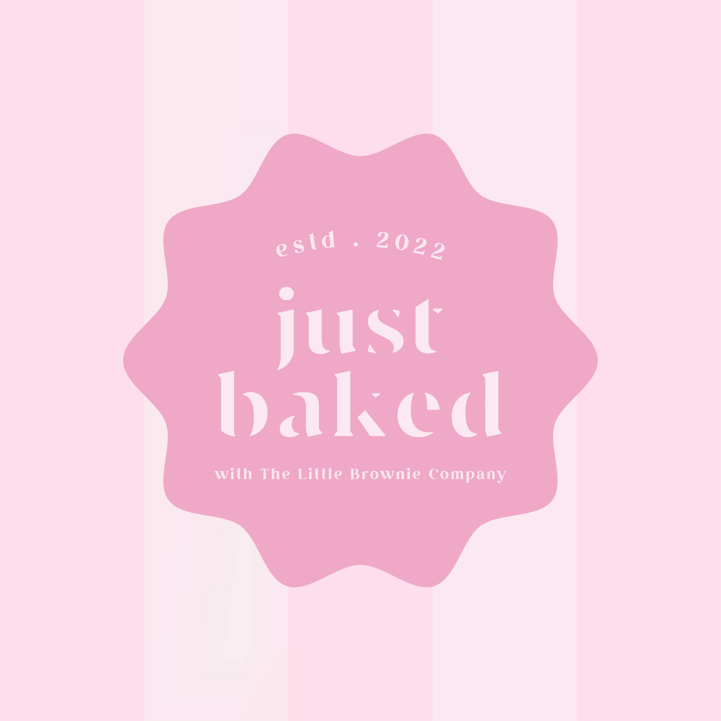
With the logo finalised, we began applying the new visual identity across a range of materials, including packaging, signage, and social media assets. We created a cohesive look and feel across all touchpoints, using playful illustrations on things like brand patterns to bring everything to life.

The Go-Live
The results of the rebrand have been fantastic. The client is thrilled with the new visual identity, and it has been well-received by her audience. The new cafe has become a popular spot just as she’d hoped it would, with many customers snapping the brand and sharing it on socials.