
Noah’s Ark Veterinary Centre Brand Identity


The Challenge
A new veterinary clinic approached us to develop a brand identity for their practice, Noah’s Ark, set in the picturesque countryside of Kent.
With a mission to pioneer the veterinary space through specialised divisions covering breeding, everyday care, and advanced treatment, they wanted a visual identity that reflected their comprehensive services. Additionally, they sought a biblical nod in their branding, aligning with the name’s heritage while keeping things modern and approachable.

“We wanted a brand identity that felt trustworthy, welcoming, and unique, rooted in tradition but modern enough to stand out in the veterinary field.”

Our Approach
The main logo design features a dog and cat silhouette standing on an ark, forming a strong yet friendly visual representation of the brand. This imagery symbolises care, safety, and a holistic approach to veterinary services. We then developed a suite of variations and brand marks to give complete flexibility.
To complement the logo, we developed a blue-based colour palette designed to convey trust, reliability, and compassion. Dark blue establishes a sense of expertise and stability, while lighter blues introduce an approachable and calming atmosphere.
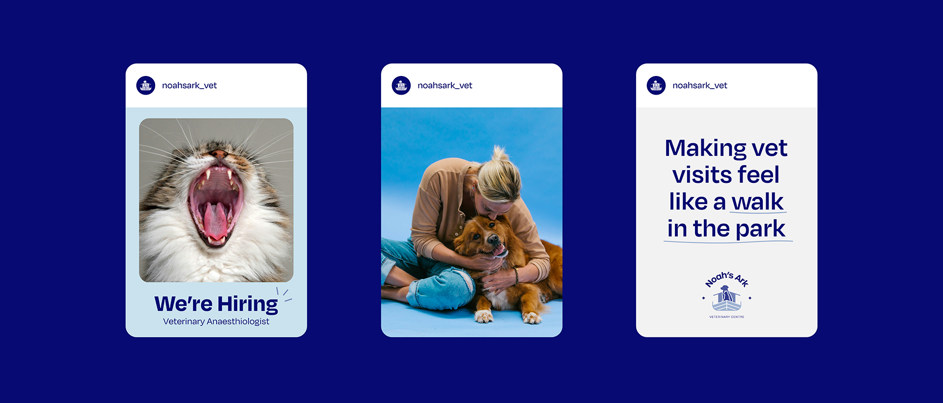
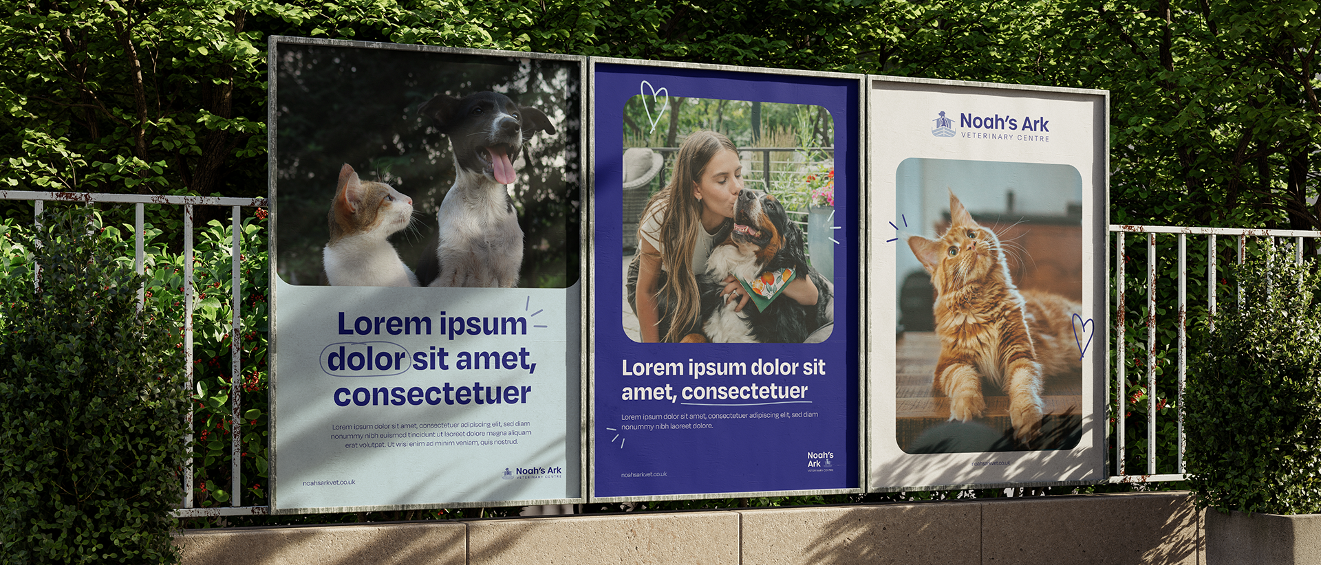
Beyond the visual identity, we’re also worked on a full suite of marketing materials, including print assets, signage and digital marketing strategies to ensure Noah’s Ark makes a strong and lasting impression.
To complement the brand identity, we also designed a responsive website that acts as both a marketing tool and an information hub. The site showcases Noah’s Ark’s services, team expertise, and special offers, all presented through a cohesive use of the brand’s colours, typography, and iconography.
Clear navigation and engaging content make it easy for visitors to explore the clinic’s divisions and access free pet care resources. The website strengthens Noah’s Ark’s mission of trust, expertise, and care — both online and in-clinic.
“By blending tradition with a modern feel, we crafted a brand identity that is both fun yet trustworthy.”


The Detail
Typography plays a key role in the Noah’s Ark identity. We selected Degular, a modern sans-serif typeface that gives the perfect balance between professionalism, readability, and versatility. Its clean and neutral design enhances the brand’s credibility while remaining friendly and accessible.
Our branding package included multiple logo variations and brand marks to ensure flexibility across various applications, from signage and uniforms to digital platforms and printed materials.
“We designed an identity that communicates care and expertise while making Noah’s Ark instantly recognisable in the veterinary world.”
The Results
With a complete logo suite, carefully curated colour palette, and tailored typography, Noah’s Ark is now equipped with a distinctive brand identity that reflects its mission and values. In addition, with print, signage, website, and digital marketing works in motion, the clinic will be well-positioned for a successful launch in the coming months.


