U-Touch Brand Identity
![]() View the website
View the website

The Challenge
U-Touch, a leading player in interactive technologies, faced a challenge common among businesses with a longstanding brand identity. Their existing branding, in place for well over a decade, no longer reflected the cutting-edge developments of their work in the touch screen space. As a digital agency specialising in brand development, we were eager to take on the challenge.

“Our brand has been brought into the modern world and we couldn’t be prouder. Our new look represents everything we stand for, and shines light on the innovative nature of our business.”
Our Approach
Our approach was rooted in a strategic blend of innovation, as well as respect for the company's heritage. We embarked on a journey to develop a new brand identity that seamlessly combined simplicity with subtle nods to U-Touch's history in touch technology, but also their growth into becoming a worldwide technology agency.
“We were delighted to be the chosen agency for this project - and given our history and understanding of the technology industry, we knew we were the best team for the job.”


The Detail
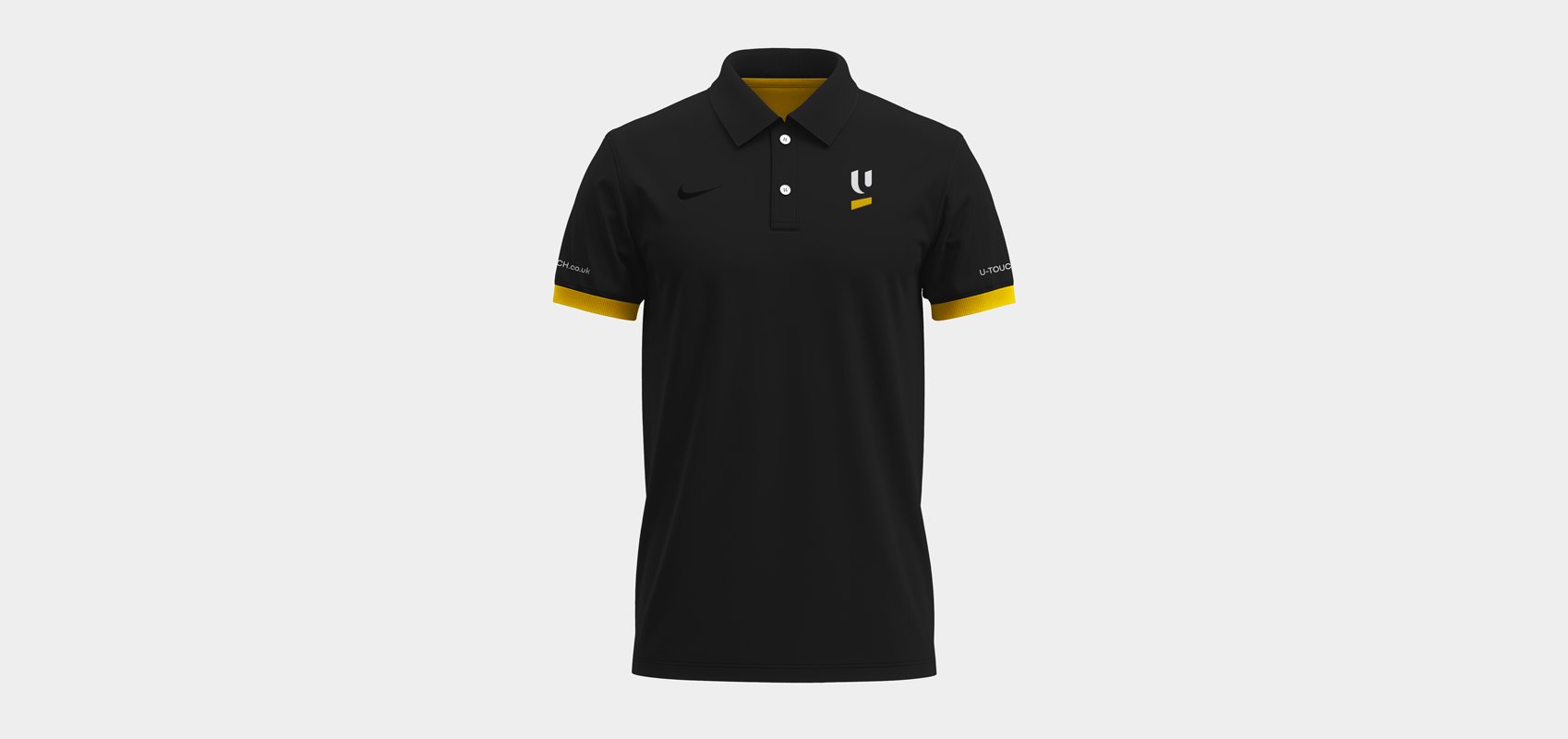
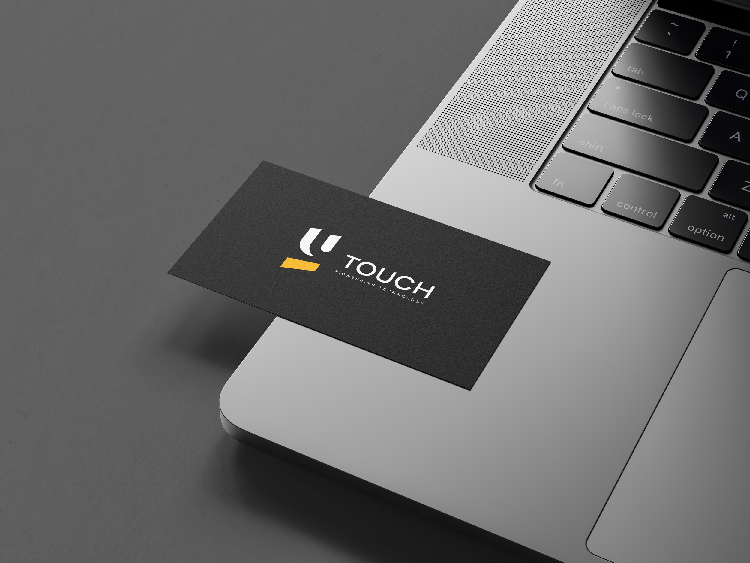
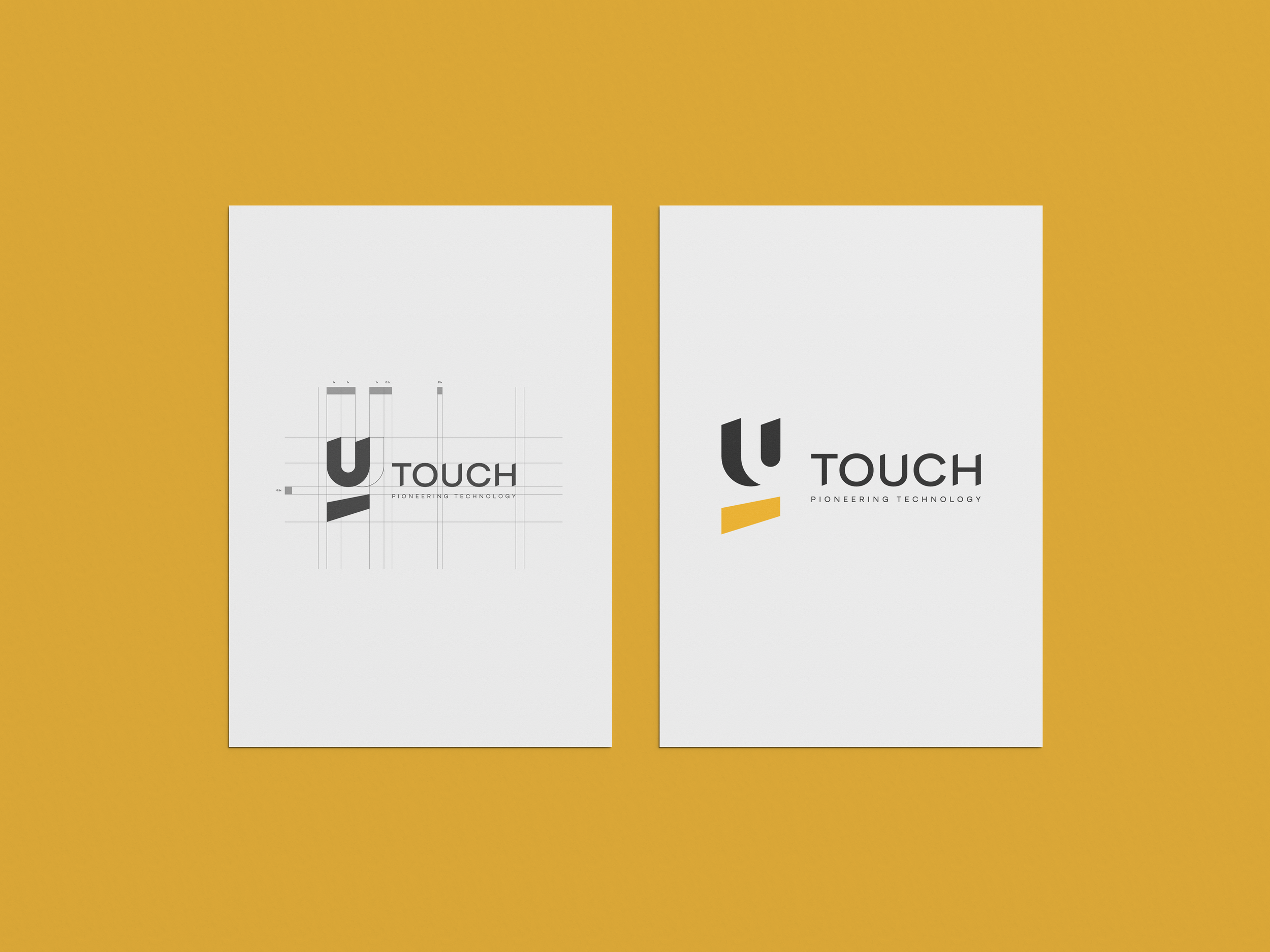
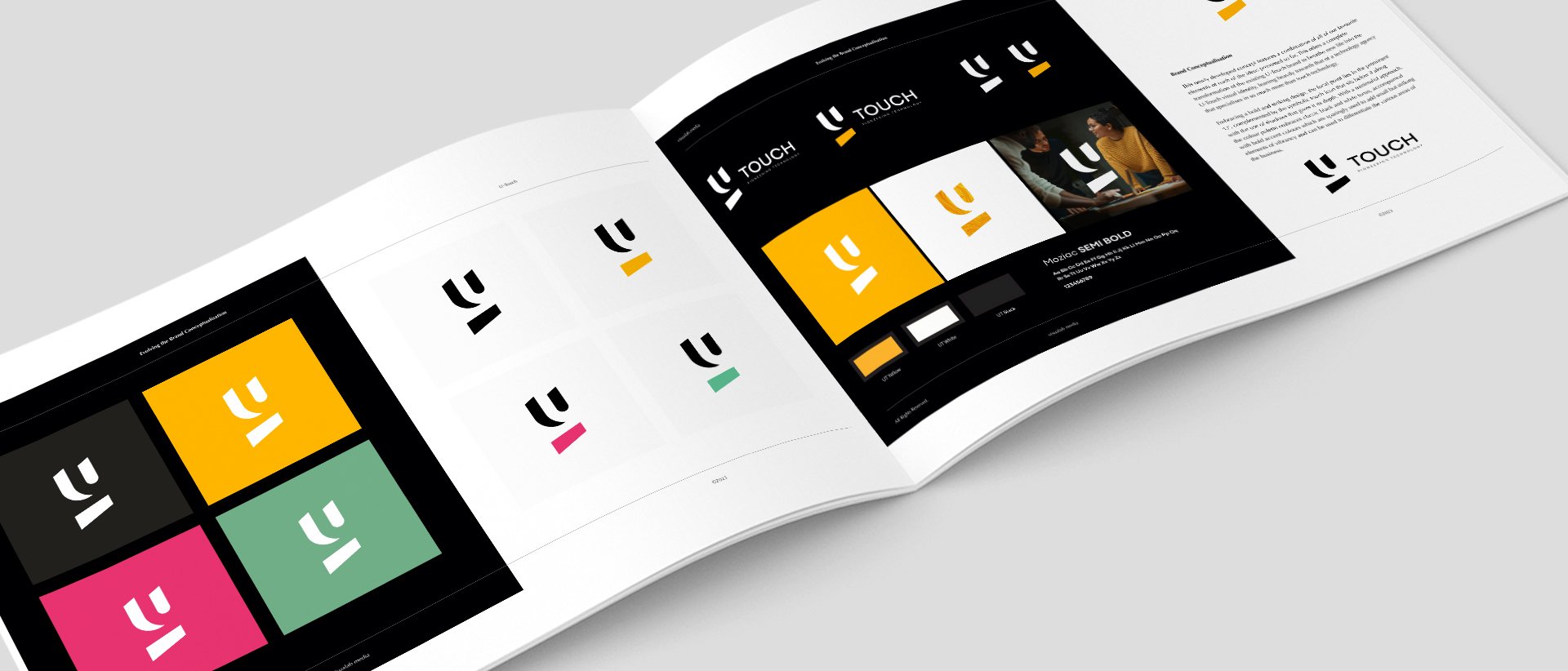
The heart of the new identity lies in its sleek and modern aesthetic. A careful selection of typefaces and design elements ensures a minimalist yet powerful look. The prominent ‘U’, sits at the centre of the design as the main focal point. Complemented by a symbolic touch icon below and enhanced with shadows for extra depth, the design captures the essence of U-Touch's evolution.
The colour palette, primarily black and white to give the brand a classic and classy feel, is complemented with bold accent colours. These additions add vibrancy into the brand and serve as visual cues to distinguish different specialities within the business. The result is a design that not only speaks to U-Touch's technological expertise but also positions the brand as a force in various sectors.

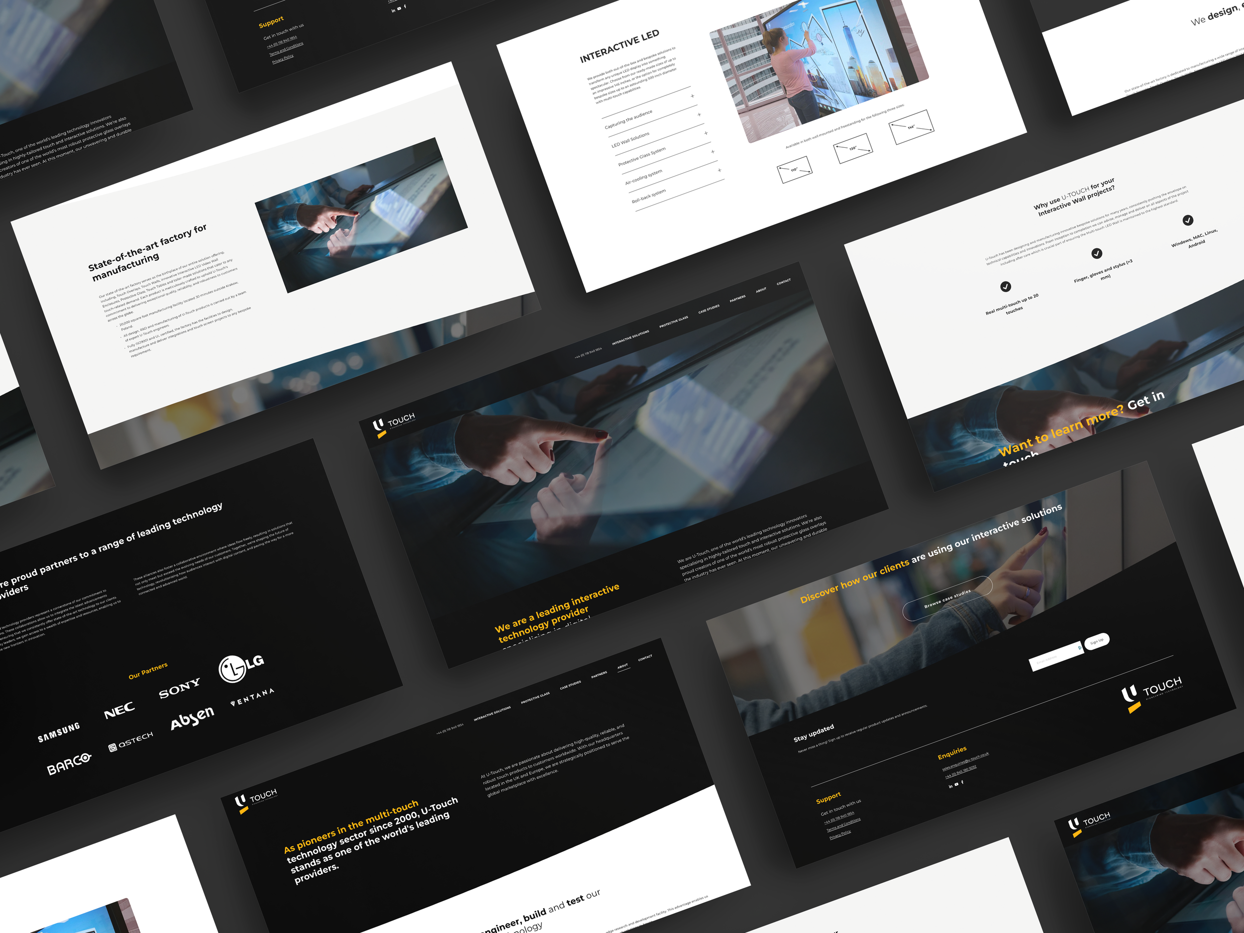
The rebranding effort extended beyond its brand marks, including new merchandise and print materials which were crafted to seamlessly integrate the refreshed identity. Additionally, a complete redesign of the website was undertaken, ensuring that it became a showcase for U-Touch's latest and greatest projects.
The Results
The impact of the brand transformation was witnessed almost immediately. U-Touch now boasts a visual identity that aligns seamlessly with its current position as a technology agency with a broad spectrum of expertise. The bold and striking design, centred around the iconic ‘U’, has not only refreshed the brand but has also gained positive attention, making U-Touch stand out in a competitive landscape.